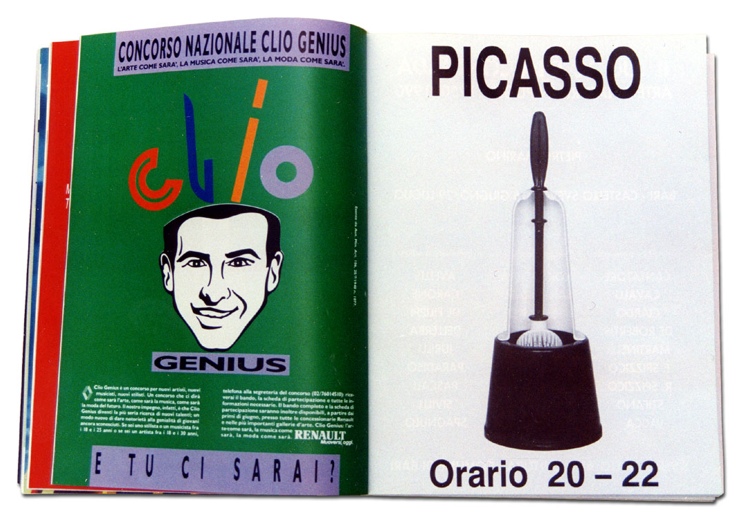
The object and the media In 1990, Carlo Buzzi a published a full-page spread in the Italian edition of Flash Art No. 156 constructed as follows: at the top in large block capitals the name PICASSO, in the centre a photograph of a toilet brush and at the bottom the phrase “Orario 20 – 22” [Opening hours 20 – 22]. The graphically well-balanced composition in black and white is similar in form to a normal event or exhibition announcement. A paid advertisement, a page among other pages, with no captions or explanations of any kind. Two further operations with similarly composed images were published in 1990, in Flash Art, No. 158, with the name “KOSUTH”, a photograph of a pair of scissors overprinted with the word “SETTLED” and the indication “Tutti i giorni dalle 20 alle 22” [“Daily from 8 to 10 PM”], and in 1991, in Juliet Art Magazine, with the name “WITTGENSTEIN”, a photograph of a key and the phrase “THROUGH NOVEMBER 1990”.
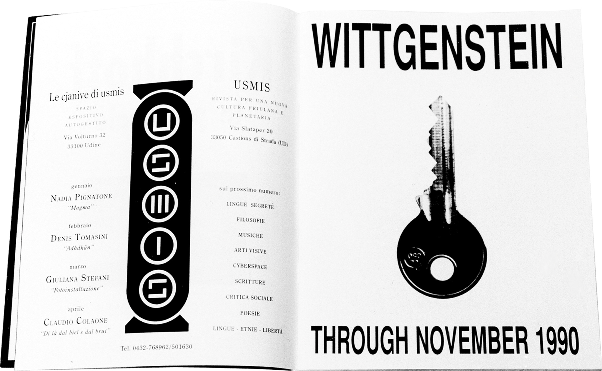
Clearly, the three chosen figures whose names are used almost as “headlines” in a press release were celebrities from the cultural rather than the general public sphere – while Picasso is known at almost all levels, the same cannot be said for the philosopher Ludwig Wittgenstein and the conceptual artist Joseph Kosuth. The objects represented are drawn from the everyday and are so banal and lacking in significance that they can hardly even be included in the category of things associated with a personal life experience. Their combination with the chosen names may be said to have been deliberated, as in a conceptual operation, or instinctive, as in a free association of a psychoanalytical or Surrealist stamp; initially, this question is unimportant, what counts appears to be the evocative capacity of the image as a whole, and its pervasive capacity.
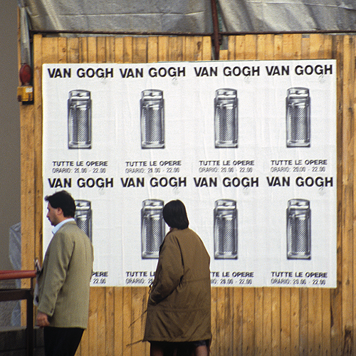
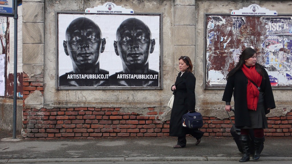
In 1991, the artist planned his first public billposting on the walls of Milan, with 140 posters exhibited for 15 days in the city’s most central quarters (the use of the verb “to exhibit” being by no means casual). The 100 x 70 cm poster presented a structure identical to the magazine advertisements described previously with additional compositional elements: at the top the name VAN GOGH, in the centre the photographic image of a metal cheese grater, then the title “TUTTE LE OPERE” [“ALL THE WORKS”] and lastly “ORARIO 20.00 – 22.00” [“OPENING HOURS 8 – 10 PM”]. In 1992, the image from the earlier advertisement dedicated to Picasso became a poster another billposting campaign on the walls of Milan. These actions are similar in terms of planning and intent to those conducted in the printed media. What changes is the location in which they take place, in the streets, in direct contact with any possible “viewer” or, in terms of feedback that while never declared is inevitable, with any possible end-user. The publicity becomes even more public, with the street or the piazza (beyond the domestic environment, substantially) as the place in which quintessentially everything becomes public or is performed publicly: we demonstrate, we protest, we shout, we share and finally we “exhibit ourselves”.
We might say, to set out the sequence of the operations, within the frame of the billboard and the regulations, but outside the gallery, within a “system” (that of art which is no longer the “art world”1 we once knew) but outside its objectives.
1 [ more ]
In this regard see the important article by Lawrence Alloway published in “Artforum” in 1972 Network: The Art World Described as a System. In:http://artforum.com/inprint/issue=197207&id=33673.
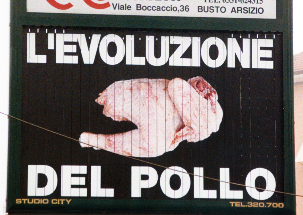
These initial trials were followed by others with posters featuring more enigmatic images that always possessed a certain communicative strength. “L’evoluzione del pollo” [“The Evolution of the Chicken”], for example, from 1993, followed by the almost consequential work featuring a detail of a butchered chicken and this time the abusively and provocatively borrowed logo “United Colors of Benetton”. The condemnation of the now overt and invasive crossover between art and advertising is clear (although in this case “condemnation” is perhaps inappropriate given the dryness of the image the coldness of the operation).
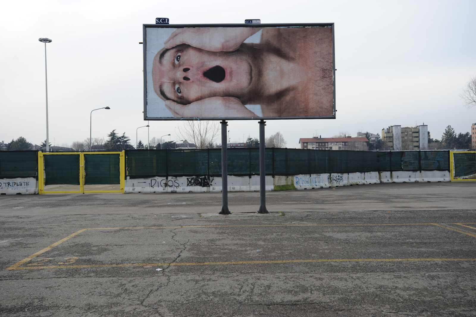
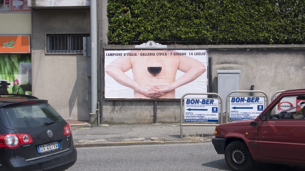
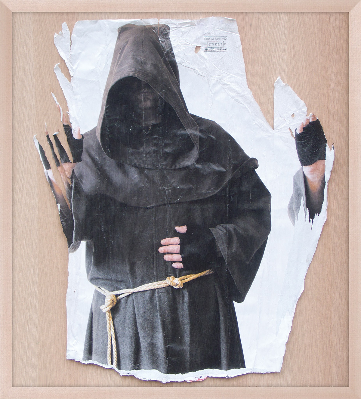
Later come the first self-exhibitions of parts of the artist’s own body, naked, masked or “faked”, which occupy the entire area of new posters. These exhibitions that have been repeated periodically through to the present day. The swollen, cadaver-like face from 1995; ironically blowing a bubble in 1998; blacked up to simulate an artist of colour in 1999 (“Artista Multietnico”) or holding a magic wand to imitate a magician in 2005. A shot from behind, showing a glass held in two hands behind the artist’s naked back and the nape of his neck is what we see in “Red Back Wine” (2013), while the same year also saw the artist pointing a forked stick in “Rabdomante” [“Diviner”]. The pleasure of imitation is also evident in the disguises used in “Incappucciato” [“Hooded”] from 1997 and as a monk in “FFPP” from 2013.
Through the “manifested” images of his own body, Buzzi is here taking the “species of artist he wants to be” directly into the streets, as if in this way his action is declared even more forcefully and with no apparent intermediation. In a later action, “The Scream” (a personal and media-based interpretation of Edvard Munch’s The Scream, undertaken in 2015) the size of the poster became a qualifying element, almost as if visibility as an artist is placed directly in relation to the physical dimension of the image, which in this case reaches 50 square metres of surface area. Two final observations have to be made regarding the objects and media used by Buzzi in his work. The first is that all the posters and the advertisements have been created in accordance with the relevant local authority and national regulations. Nothing is done illegally and the extent of the campaign depends exclusively on the economic investment. The size of the images instead depends on the size of the space (billboards) available or planned for. The second is that in the exhibitions that follow or alternate with the operations in the field, the bureaucratic documentation necessary for their actuation is frequently exhibited, together with photographs of what may be defined as the “open installations” and framed posters removed in their entirety or as scraps. The artist defines these actions as the “formalization” of the event and the use of this bureaucratic term seems to indicate, and exhibit, the remoteness of a wholly conceptual operation that concedes nothing to his own emotions and those of others. This is something that instead has to deal with the fact that these actions appear to be the sign of a deliberate, active withdrawal of contents and forms from the world of wall images and therefore from a living, open and pulsating social world.
The method What kind of images has Carlo Buzzi invented and does he continue to invent? I would say advertising messages that appear as the carriers of reliable information despite their spareness and, above all, their obvious incompleteness. What we see hardly coincides with what we come to know and with what we should already have known. The observer observes but does not know exactly what he is seeing and this is the first result for the artist who thus reveals that which is a reality of human and social existence.
The visual, graphic and verbal elements of these posters relate to one another, this is clear, but not so much revealing new evidence of meaning as investigating the constitutional elements of advertising communication understood as an expressive element in its own right in the creation of the work of art. A work that, in this way, becomes even more complex and well-structured: a campaign project, an image, scripts, a materially inexistent product that becomes abstraction and thought and, lastly, a tangible “thing” that documents, but also fragments, the work itself. The appropriation of advertising media constructs the method with which the artist “makes art” and through which he overcomes the location of art, the gallery or the museum, to create what he understands as “Public Art” rather than Publicity; thought rather than product. Naturally, as is always the case with contemporaneity, everything merges in Carlo Buzzi’s project too: the world of the everyday with the world of art, the language of commerce with that of poetry and that which is a refusal of cultural customs becomes the consumption of prepacked images. Wittgenstein, Picasso, Van Gogh and Buzzi’s own identity are both mere words and evocations and real people; but what they will be at the moment the posters are seen will be decided by the observer alone, more or less consciously and in relation to the place in which they are seen. Publicly displayed posters are not the circumscribable images we might find on the white walls of a gallery. That which we are really permitted to see is the result of their interaction with the types of wall to which they are affixed, with the other posters alongside them, with all the rips and superimposed scripts. A surrealist game, a kind of modern and even more dilated “cadavre exquis”, the associations of which read in their unity will be revelatory regarding the subterranean pulses, the thoughts of the spirit of place and moment, perhaps impersonal and perhaps instead a faithful but rather undesirable mirror of a collective subconscious.
The brand Carlo Buzzi defines himself as a “Public Artist” and, specifically, the only true public artist. He does not say what the relationship is (what consequentiality?) with the term Public Art2, which embraces the most disparate expressive forms, from monumental art to urban relational interventions. However, in my opinion, the definition the artist has identified does not constitute the taking on of a role. It is instead a deliberate digression (a digression that is always present in his work) into the ambit of professional advertising communication, undertaken to study and understand the instruments he was to use, as we have already seen, as media for the making and not solely the communication of art. A signature, a marque, a slogan that in its clear formulation, albeit with ambiguous contents, is capable of inducing expectations in the minds of those who find it association with an artistic product. In short, we are talking about the creation of a brand, that of the only true public artist, which can be seen as an additional and signifying element to the previously declared personal expressive grammar and which is in line with the current era steeped in advertising and brand awareness, whatever the term may be taken to mean3.
2 [ more ]
Public art replaces neither architectu‐ re nor urban planning, but disturbs and provokes both: it subverts spatial and temporal coordinates, it defeats conso‐ lidated habits, stimulates the public to live space in an active and participatory fashion. «Public art has to squeeze itself in, introduce itself below, overlie what already exists in the city. Its ap‐ proach consists of executing opera‐ tions in built environments» (“Lo spazio pubblico in un tempo privato”, in Vito Acconci, p. 132). «The public artist is required to intervene not on the buil‐ dings, but on the footpaths, not on the streets, but on the benches at the sides of the streets, not on the city but on the bridges between one city and another. Public art functions as a footnote: it can only comment on or contradict the main text of a culture» (“Andare all’esterno”, in Vito Acconci, p. 140) (Adachiara Zevi, “Arte e spazio pubblico”, “Enci‐ clopedia Treccani”, ad vocem, www .treccani.it, 2015).
3 [ more ]
The concept of a “brand” has been as‐ sociated with contemporary for many years. Cf the article in The Economist: “Portrait of the artist as a brand” (ww‐ w.economist.com/node/499033, 2001). And also the statement: Damien Hirst is a brand, because the art from of the 21st century is marketing (G. Greer, Germaine Greer Note to Robert Hughe‐ s: Bob, dear, Damien Hirst is just one of many artists you don’t get, in: www.the‐ guardian.com/artanddesign/2008/sep/ 22/1, 2008).
The red herrings What relationship is there between Carlo Buzzi’s torn posters and those of the “Affichistes”? Very little I would say. The torn posters, the collages, the assemblages and the overlapping of the latter are methods for the composition of a surface, for giving formal substance to a working project. Colours and subjects, concealments or revealings, the poster scraps or the stratified parts are all compositional elements, almost pictorial albeit atypical, that speak primarily of their own language and secondarily of textual elements share with a more or less extended community4.
4 [ more ]
Mimmo Rotella speaks of his “décolla‐ ges” in the following terms: I was im‐ pressed by the walls covered with torn posters. I was literally fascinated by them, in part because I thought at the time that painting was finished and we needed to discover something new, li‐ ving and current. (…) Most of my décol‐ lages are taken as I found them, alrea‐ dy worked by the man in the street and by the weather (in: Rotella’77, Il Colle‐ zionista, Edizioni/1, Rome, February 1977).
Buzzi instead creates and then posts, and his rips are born out of, deliberately or otherwise, the will to subtract his conceptual work, the initial proposal, from the destructive action of time and the natural process of corrosion that afflicts anything left to its own destiny. Almost a gesture of self-conservation actuated through the recovery of part of his ideas and the images created. This is why the encounter with Buzzi’s “recovered works” and the surviving frescoes present in the Civic Museum at Campione d’Italia (in the exhibition Antologia Pubblica, held in the spring and summer of 2013) was so powerful. The relationship between the centuries-old and the new images, both “saved” in fragmentary form rather than being presented in their entirety, revealed their common symbolic value, that of a very human gesture of protection and conservation, that even overcomes the aesthetic and iconic value.
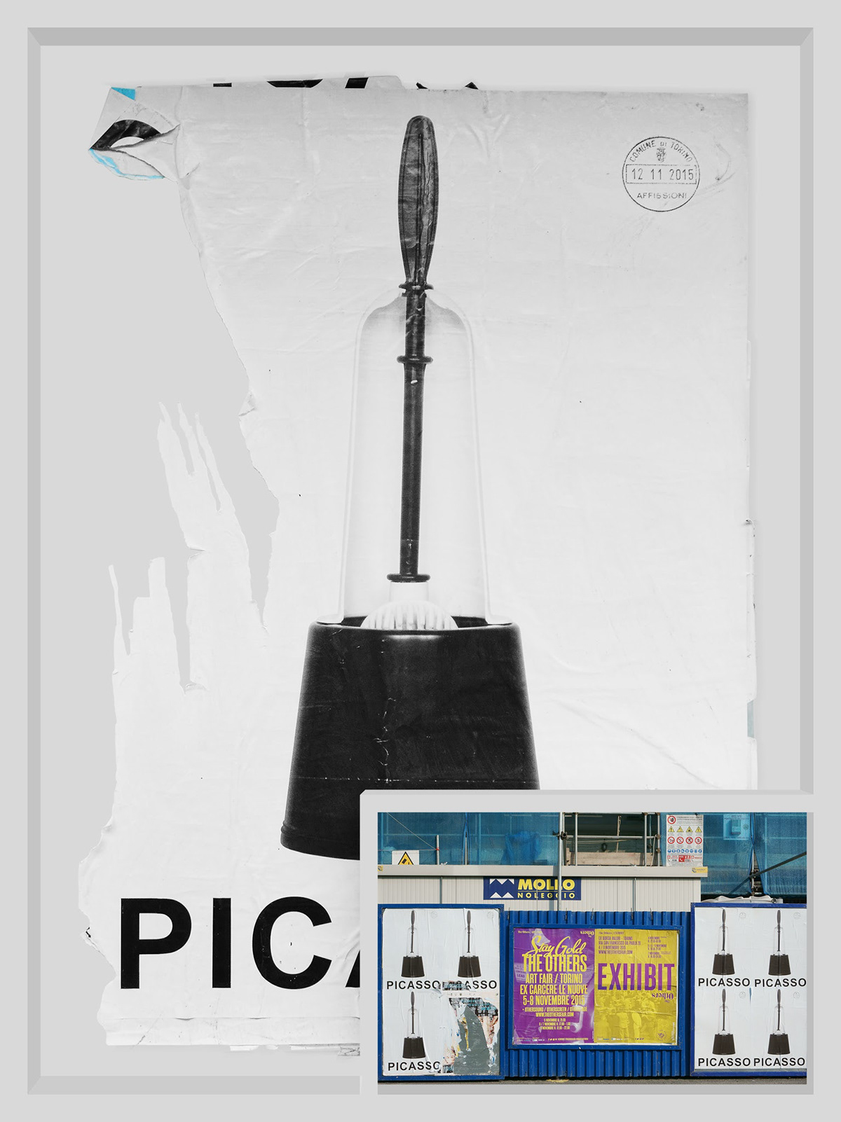
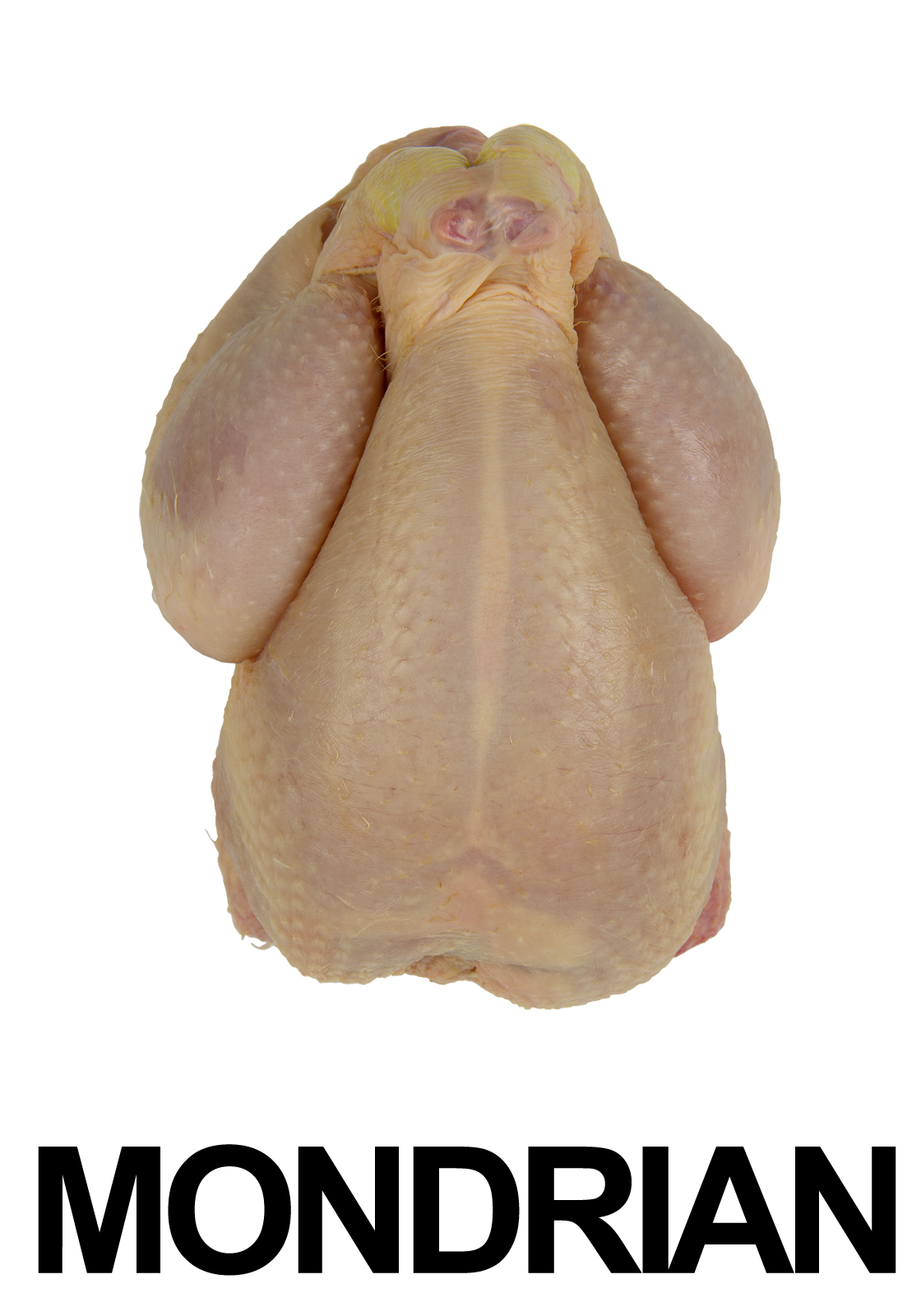
Carlo Buzzi’s anti-dogmatic connections in Turin In October-November 2015 Carlo Buzzi, in collaboration with Paolo Tonin of the contemporary art gallery of the same name, created a poster campaign in Turin with three different designs (80 posters per subject), starting on the 28th of October for 15 days. Half were presented in the city centre, the others in the Lingotto quarter, home of the Artissima art fair. He returned to the first subjects used in the 1990s, rendering the compositions leaner, stripped down. In substance, he effected a further reduction of the signifying elements present in the three types of poster: the names of three artists, Van Gogh, Picasso and Mondrian (this being the first name of an artist used for a photomontage prior to 1990) and the metal grater for the first, the toilet brush for the second and a plucked chicken (a butchered fowl like the one in the Benetton work, but used differently) for the third. The communicative ambiguity of the works from 20 years earlier disappeared along with the disappearance of the opening times and other words that, while being insufficient to lend concrete purpose to the communicative device, were nonetheless elements directing the perception in a multi-faceted programmatic intervention. Formally, the operation remained the same, a billposting creating a “public place”, but the resulting information provided is different: clearer might we say? More defined? More disorienting? There is a clear polemical component with regard to the so-called “art system”, but we also have to ask ourselves whether the artist is still questioning the relationship between advertising and art, or rather the possibility that a certain type of communicative medium, and the very idea of communication, can contribute to the creation of an artistic product with non-traditional qualities and objectives. Perhaps this relationship is now taken as a given, after all many years have passed since the first operation, and what is being investigated now is the effect of the verbal-figurative associations that are no long the “free associations” of the Surrealists, mutated by psychological studies, but those which widespread “popular” culture “filters” (this is itself a paradox) and proposes as systems of thought that then become patterns of behaviour.
Clearly, Vincent Van Gogh is not identified with a cheese grater any more than Pablo Picasso can be with a toilet brush or Piet Mondrian with a chicken, this is not the artist’s “message” but rather the question of how these associations are received and what effect they produce in the mind of the observer; and whether all this has something to do with art or not rather than with its banalization, a practice that has attained a certain constructive and formal relevance in contemporary production and is therefore certainly worthy of attention.
Fabrizio Parachini is a visual artist and a curator of contemporary art exhibition. He is also a Fine Arts Academy lecturer in Theory of Visual Perception and Chromatology, subjects tackled and developed on the basis of modern research conducted in the fields of neuroscience and neuroaesthetics.